Alexander’s Patisserie Website Redesign
Alexander’s Patisserie Website Redesign
An enhanced experience for a luxury patisserie
My Role: UX/UI Design, Research, Framework, SEO Implementation, Graphic Design
See live: alexanderspatisserie.com
Challenges
The original website didn’t reflect the elegance of the store. It lacked structure, was difficult to navigate on mobile, and lacked seasonal storytelling. Customers - whether old or new - were missing key information, or rather bouncing from the website entirely.
Goals
Improve user accessibility, make product info easier to find, add marketing tools like email signup and social media, and align brand visuals across all pages
Process
I analyzed user behavior on the old website, which had too many pages and buttons. For example, to place an order, a customer had to click the “Order Online” button, then be directed to a page with two options: “Order for Mountain View” and “Order for Cupertino.” After selecting one, they would reach another page (see picture) indicating they were leaving the site for a third-party platform. Overall, it took about four steps to order, though it could be done in fewer than two.
Approach
My redesign focused on accessibility and clarity. I prioritized making information readily available for new and returning customers, especially those unfamiliar with the patisserie. Core offerings like afternoon tea, brunch, pastries, and seasonal menus were brought to the forefront to reduce friction and enhance discoverability.
Execution
As the sole designer, I handled all visual design, content strategy, and structure. I created the site layout in Figma and Illustrator, rewrote all content for clarity and consistency, and implemented embedded email forms for marketing. Every element was designed to reflect the in-store experience and help customers quickly understand what the patisserie offers.
Before: Homepage
Before: Leaving Page
Redesign Visuals
Homepage Mockups / Mobile + Desktop

Homepage

Quick access to pages
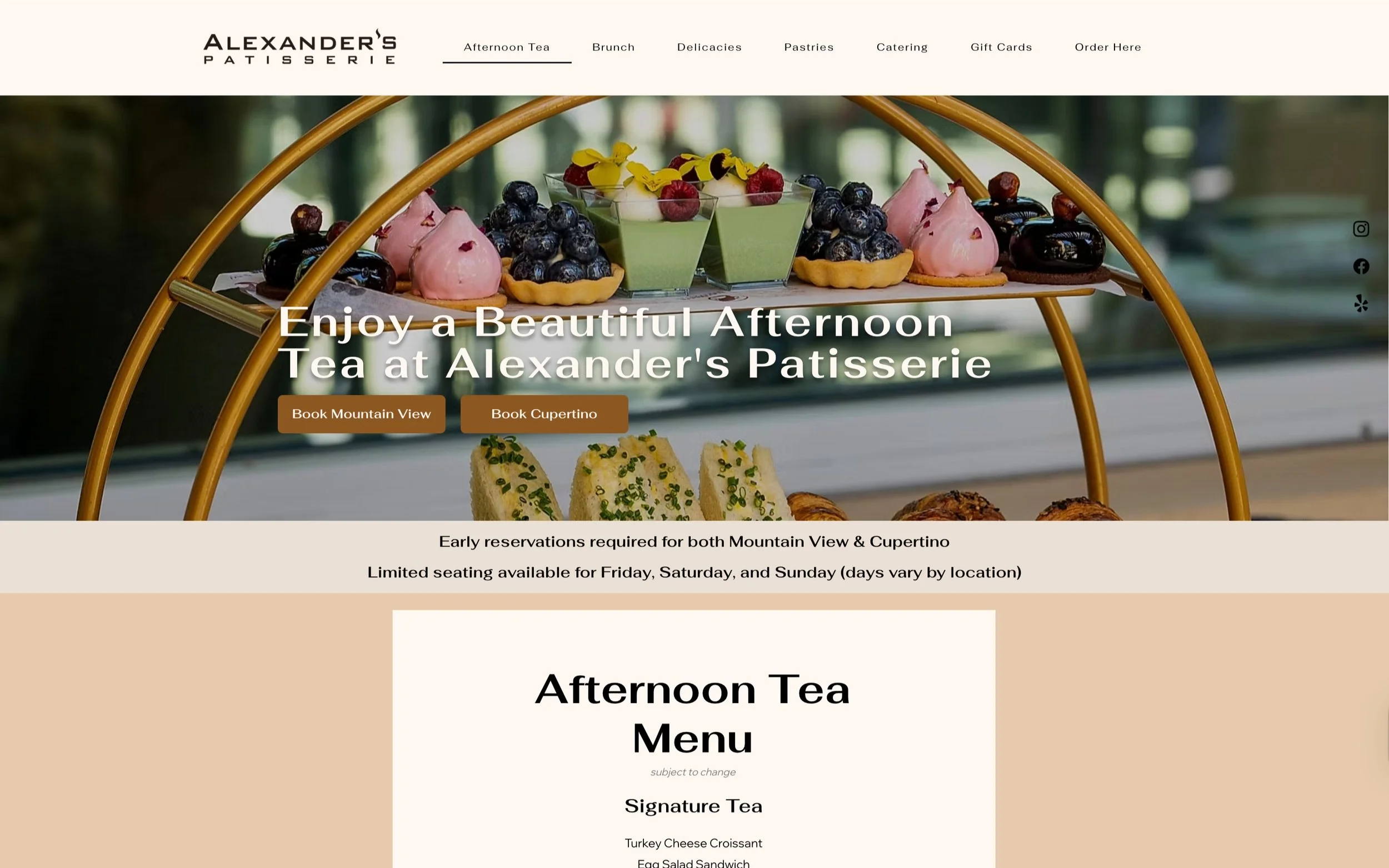
Afternoon Tea
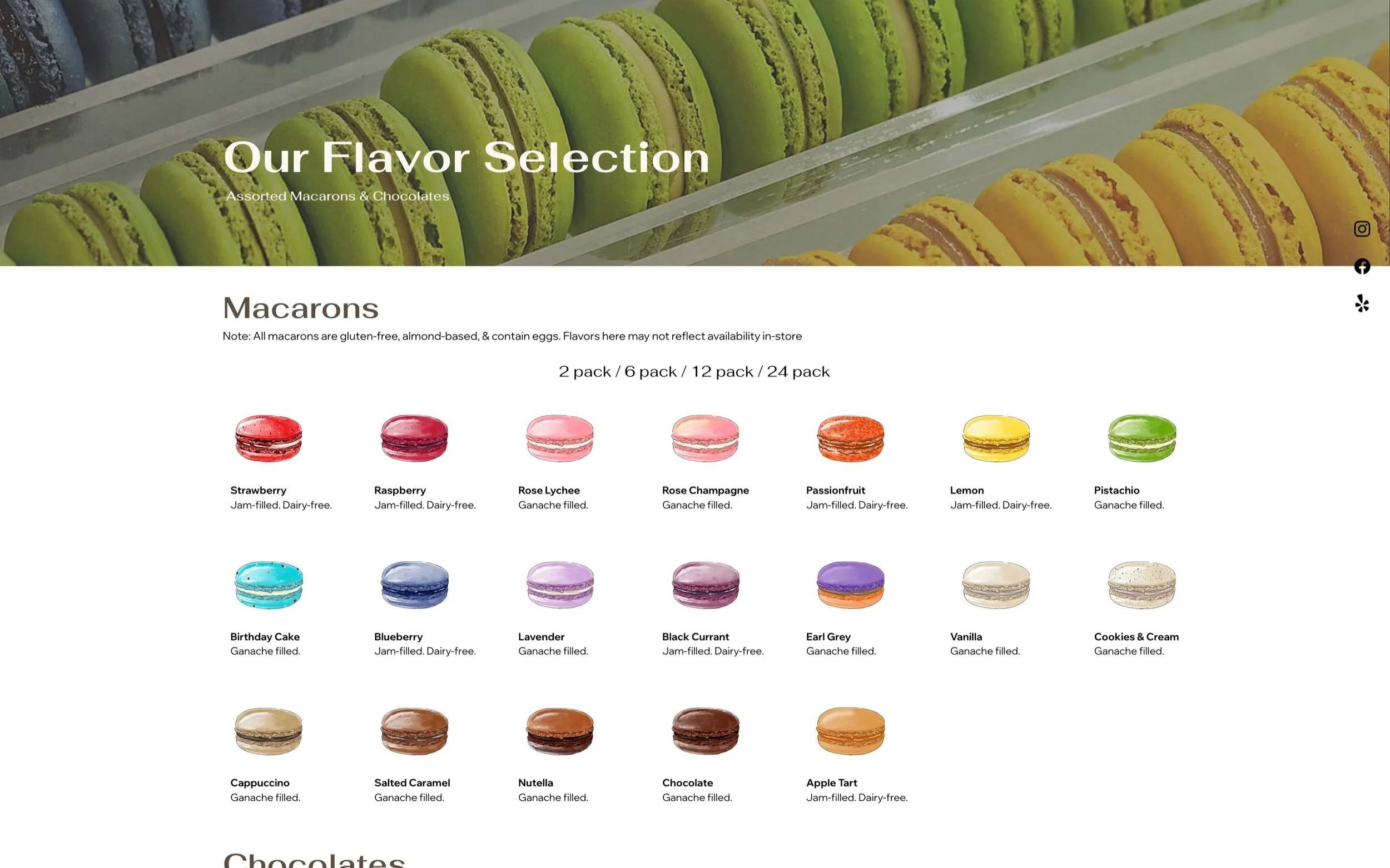
Flavor Selection

Viennoiseries

Entremets
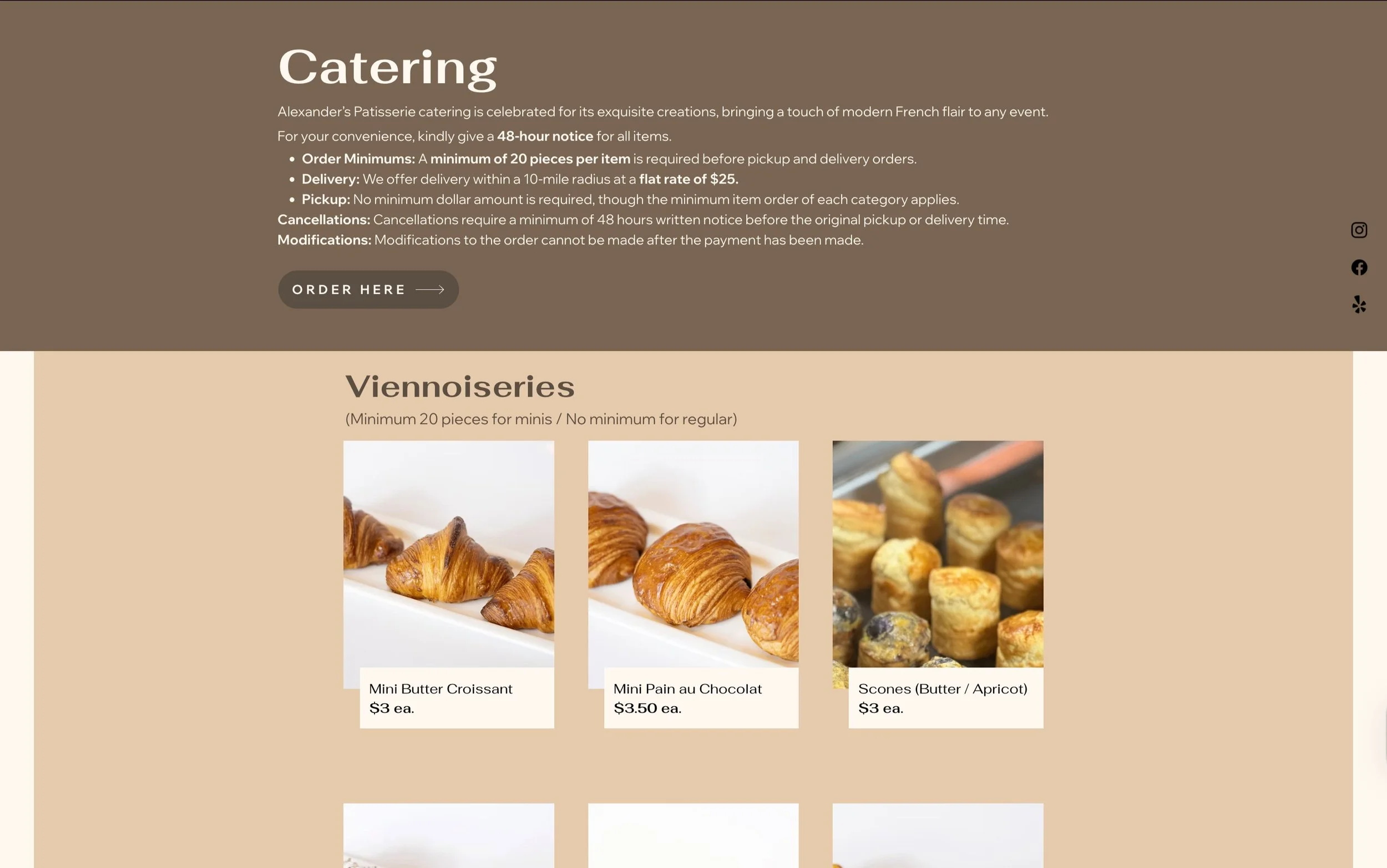
Catering